


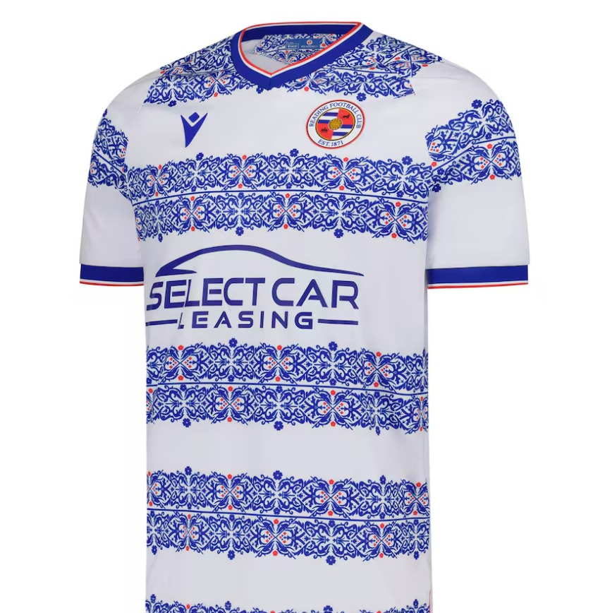
Reading FC fans have given their reaction to the release of the club’s new home kit for the 2025/26 season.
Kit designer Macron have opted for a unique design on this season’s kit which features a distinctive design on the hoops.
The kit is in homage to Huntley & Palmers, a biscuit company which was founded in Reading.
Reading fans have been used to some unique designs over the past few years which included the University of Reading’s ‘climate stripes’ on the sleeves of the 2022/23 home kit and then a kit featuring landmarks around Reading the next season.
Fans have given a mixed reaction to the reveal of the new kit.
One user on X said: “My goodness that is absolutely disgusting.”
Another said: “That is the worst kit I have ever seen.”
Another added: “Awful, in my view – not distinctive as bold blue hoops – you’re dressing footballers as biscuit tins!”
However, there were also some positive reviews.
A user said: “I like it! Huntley & Palmers are iconic in Reading and great to remember where we come from. Rather than a dull blue hoop around the shirts.”
Another said: “I like it. Love the nod to the past. We’ve been through a hell of a lot as a club recently, and it was what we’ve been fighting for… 153 years of history to continue.”
To buy the new kit, visit: https://fanstore.readingfc.co.uk/en/reading-football-kits-home/


