


CLIMATE change images were shared across the globe on Monday, June 21, to mark the summer solstice.
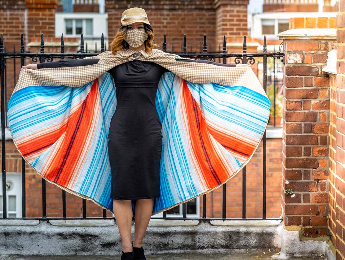
Created by the University of Reading, the latest climate data has been illustrated in coloured stripes.
They show the continued heating of Earth over 150 years, and include annual temperatures for last year.
Each stripe represents the average temperature for a year.
Blue indicates cooler-than-average years, while reds show years that were hotter-than-average.
Earlier this week, weather presenters, scientists, campaigners and the public shared their stripes on television and social media.
Professor Ed Hawkins, a climate scientist at the university, created the visuals.
Last week, he was named in the Sunday Times Green Power List of the UK’s 20 most influential people in environment.

Professor Robert Van de Noort, vice-chancellor of the university, said: “Acting on the climate emergency is much harder and will require everyone to play a part. As one of the world’s leading universities for the study of climate change and education, it is absolutely right for the University of Reading to take the lead in helping young people to discuss, debate and learn about climate change.”
The university has launched a new campaign called Partnering for the Planet, to encourage working together to tackle the climate emergency.
As part of this, it will host a Climate Education Summit on Wednesday, September 15, to discuss changes to teaching children about the issue.
It is hoped the summit will create an action plan on climate education, which will be presented to leaders at the COP26 conference in Glasgow.


